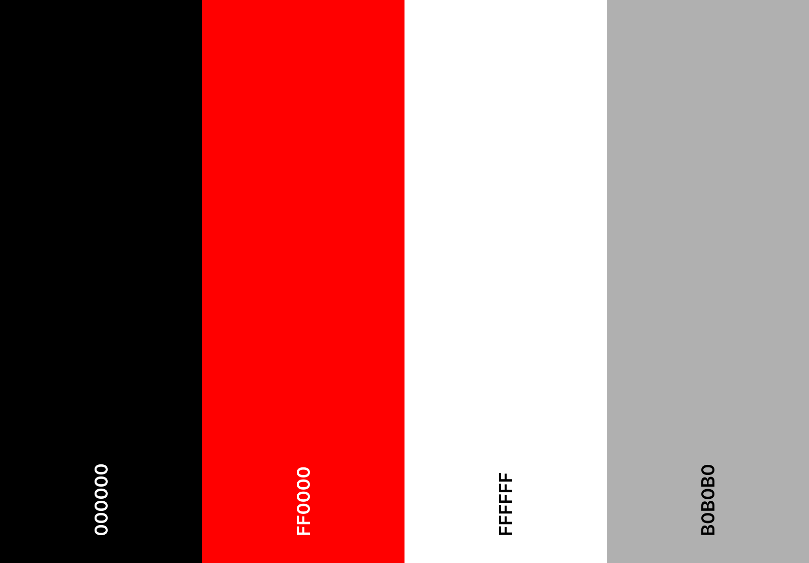
Color Palette Selection
- Step 1: Inspiration - I began by exploring various websites and design portfolios to gather inspiration. This helped me understand what color schemes resonated with me and what I wanted to avoid.
- Step 2: Color Theory - I brushed up on my color theory. Remember the color wheel from art class? Turns out, it's actually useful! Complementary colors, analogous colors, triadic colors... it's like a soap opera, but with hues.
- Step 3: Testing - I created a few mockups with different color combinations. Some were hits, some were misses. One looked like a unicorn threw up on my screen. But hey, you live and learn.
- Step 4: Feedback - I asked friends and family for their opinions. My mom said everything looked great, but she's biased. My friends were more honest. Brutally honest. But it helped me narrow down my choices.
- Step 5: Final Decision - After much deliberation (and a few sleepless nights), I finally settled on a color palette that I love. It's professional, yet fun. Just like me. Or at least, that's what I tell myself.
Choosing a color palette for a website is like picking an outfit for a first date. You want to look good, but not like you tried too hard. Here's how I went about it:
And that's how I chose the color palette for my portfolio site. It was a journey, but totally worth it. Now, every time I look at my site, I can't help but smile. And isn't that what it's all about?
